How to paint a landscape (from a photograph) with a limited palette
We already started to learn about the power of a
limited palette to create a cohesive
color world in the last class. A color world within a painting ties all of the elements in the picture together in a unified sense of space and light, and even time for that matter.
To see this effect in action, look at the work of
Maurice Prendergast (above). In a
separate blog post, I analyze the palette of Prendergast in depth. But for now we are going to try to understand the concept of a color world by looking at an artist who intentionally
disrupts the color worlds of his paintings, with jarring results.
Take this
counter-example by contemporary artist Neo Rauch:
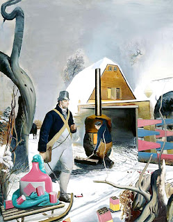 |
| Neo Rauch |
In this painting Neo Rauch uses a break in the color world to signify a break in time. Imagery from disparate historical eras are juxtaposed by using bright pastel colors against more drab grays and browns. This results in an image that looks like a collage, even though it is all painted on one canvas.
Now look at these Haystack paintings by Impressionist painter Claude Monet. These painting present a very cohesive
color world through the use of a
limited palette. Also note the cool blue/ violet shadows, complimentary of the warm yellow/ orange sunlight.
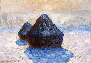 |
| Haystack in Snow by Monet |
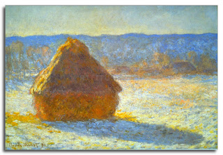 |
| Haystack by Monet |
Today we will pain a landscape from a photograph using a limited palette. Select a good quality photograph that is not too small to use as a reference.
1) First select shades of the 3
primary colors to use. Blue, red, yellow.
2) On a white piece of paper make a sample palette including mixed
secondary colors. Violet, green, orange. Also mix the
tertiary colors you may need. (reference color wheel below)
3) Select your composition. Will it be the full photograph or cropped? Make a
light pencil sketch to block in the composition, without too much detail.
4) Begin by painting the shadows using blue-violet or blue. You will end up with a
tonal image. Notice how I left the areas not in shadow as white.
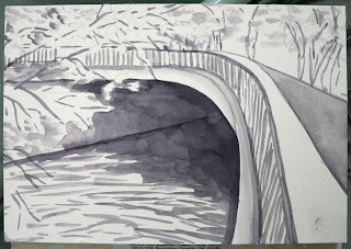 |
| Painting shadows with violet to get a tonal composition. |
5) Start to add
transparent layers of
local color. Make sure to leave some white peaking through to give air to the painting. Notice how the water and foliage are broken up into brushstrokes rather than as a solid wash. This lets the painting
breath! Important!
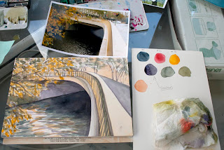 |
| My palette next to the paintings and the source photo. |
6) Add brighter dabs of
accent color, more saturated color in certain places.
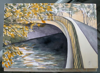 |
| Finished painting with limited palette. |
This student watercolor by Alexandre Dupuis uses a very limited palette, mostly just blue and red, to great effect! Notice how he implies detail without getting fussy!
 |
| Watercolor by former student Alexandre Dupuis |
Color Wheel
Since some of the color wheels from the first class turned out a bit disorderly, here is a reference that also shows what secondary and tertiary colors are.


No comments:
Post a Comment
Note: Only a member of this blog may post a comment.