website

This is an archive of our retired blog. Please visit out current website

www.berlindrawingroom.com

Showing posts with label limited palette. Show all posts

Pastel Hues of Maurice Prendergast

Maurice Prendergast (1858-1924) was a masterful painter and colorist. His watercolor paintings have a beautiful shimmering luminosity, achieved through his transparent use of color and loose brushstrokes. His use of color is very much inspired by impressionist painters, like Claude Monet, who attempted to capture very exact moments of light. This atmosphere of light and color is created through the use of a "color world," painting with a very limited palette. 

In each painting, Prendergast uses a variation of the primary colors (red, yellow and blue) as his base. I have identified the specific hues used for each painting so you can more easily see the palette he used.  The three hues you see below the painting are the primary colors used in the painting. All other shades have been mixed from these three colors. 

Try replicating one of Prendergast's color worlds in your own painting by using the same palette.  Just remember, when using watercolor, when it looks like the color has been mixed with white, this just means that you are seeing more white from the paper showing through.  The paint is made more transparent by mixing it with more water. 


 Can you identify the palette used for the following paintings? Try to identify one hue of red, one hue of blue and one hue of yellow from the painting.  You will see that all other colors can be mixed from these primaries.


Neo Rauch and his discordant color world

We discussed Neo Rauch's work in our Watercolor Workshop, even though these are primarily oil paintings, because he uses color in a unique way. The concept of a color world (refer to previous post) within a painting is simple yet elusive, and in order to better understand this concept, Neo Rauch's work was offered as the counter-example.  The most classic example of cohesive color world, using a limited palette, is found in Claude Monet. 

Claude Monet: landscape with a limited palette

Neo Rauch uses clashing color worlds in his paintings, thereby offering an example of a discordant color world. This gives the painting a collaged feeling, rather than a unified atmosphere.

A contemporary artist working with color in a wonderful and surprising way is Jason Mones. His blunt and often confrontational images of masculinity are painted in pastel hues, contradicting the subject matter.
See images here http://jasonmones.com

Jason Mones
Here is some of the basic important information about this artist, lifted from Wikipedia (where else?).

"Neo Rauch (born 18 April 1960, in Leipzig, East Germany) is a German artist whose paintings mine the intersection of his personal history with the politics of industrial alienation. His work reflects the influence of socialist realism, and owes a debt to Surrealists Giorgio de Chirico and René Magritte, although Rauch hesitates to align himself with surrealism. He studied at the Hochschule für Grafik und Buchkunst Leipzig, and he lives in Markkleeberg near Leipzig, Germany and works as the principal artist of the New Leipzig School.[1]The artist is represented by Galerie EIGEN + ART Leipzig/Berlin and David Zwirner, New York.
Rauch's paintings suggest a narrative intent but, as art historian Charlotte Mullins explains, closer scrutiny immediately presents the viewer with enigmas: "Architectural elements peter out; men in uniform from throughout history intimidate men and women from other centuries; great struggles occur but their reason is never apparent; styles change at a whim."[2]"

Can you tell which colors clash with the dominant color world of the painting?  What is the artist trying to say with his odd use of color?  How does this effect our reading of the image?


Watercolor Landscape with Limited Palette

Maurice Prendergast
How to paint a landscape (from a photograph) with a limited palette

We already started to learn about the power of a limited palette to create a cohesive color world in the last class. A color world within a painting ties all of the elements in the picture together in a unified sense of space and light, and even time for that matter.
To see this effect in action, look at the work of Maurice Prendergast (above).  In a separate blog post, I analyze the palette of Prendergast in depth. But for now we are going to try to understand the concept of a color world by looking at an artist who intentionally disrupts the color worlds of his paintings, with jarring results.

Take this counter-example by contemporary artist Neo Rauch:
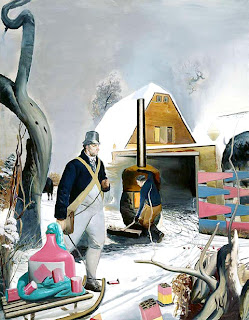
Neo Rauch
In this painting Neo Rauch uses a break in the color world to signify a break in time. Imagery from disparate historical eras are juxtaposed by using bright pastel colors against more drab grays and browns. This results in an image that looks like a collage, even though it is all painted on one canvas.

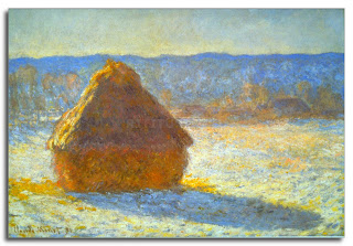
Now look at these Haystack paintings by Impressionist painter Claude Monet. These painting present a very cohesive color world through the use of a limited palette. Also note the cool blue/ violet shadows, complimentary of the warm yellow/ orange sunlight.
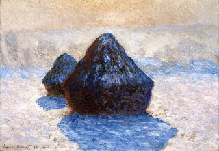
Haystack in Snow by Monet
Haystack by Monet


Today we will pain a landscape from a photograph using a limited palette. Select a good quality photograph that is not too small to use as a reference.

1) First select shades of the 3 primary colors to use. Blue, red, yellow.
2) On a white piece of paper make a sample palette including mixed secondary colors. Violet, green, orange. Also mix the tertiary colors you may need. (reference color wheel below)
3) Select your composition. Will it be the full photograph or cropped? Make a light pencil sketch to block in the composition, without too much detail.
4) Begin by painting the shadows using blue-violet or blue. You will end up with a tonal image. Notice how I left the areas not in shadow as white.
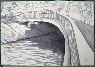
Painting shadows with violet to get a tonal composition.
5) Start to add transparent layers of local color. Make sure to leave some white peaking through to give air to the painting. Notice how the water and foliage are broken up into brushstrokes rather than as a solid wash. This lets the painting breath! Important!
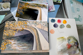
My palette next to the paintings and the source photo.
6) Add brighter dabs of accent color, more saturated color in certain places.
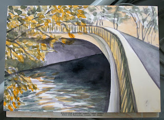
Finished painting with limited palette.
This student watercolor by Alexandre Dupuis uses a very limited palette, mostly just blue and red, to great effect! Notice how he implies detail without getting fussy!
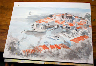
Watercolor by former student Alexandre Dupuis


Color Wheel
Since some of the color wheels from the first class turned out a bit disorderly, here is a reference that also shows what secondary and tertiary colors are.